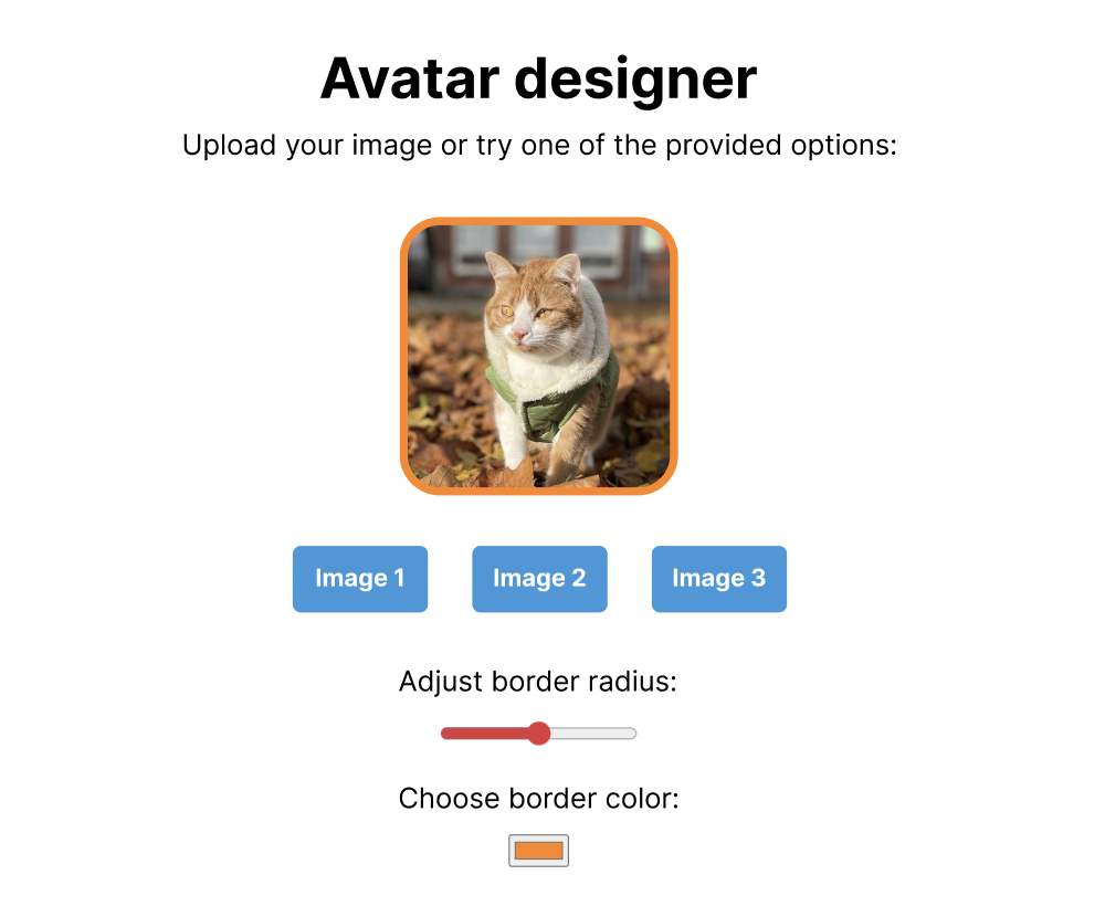
The beginner version of this project lets you adjust the border-radius and color for the existing images by means of a slider and a color picker. Clicking on the image buttons (image 1, 2, and 3) swaps the image so you can preview different avatars using the same border-radius and color.
"Start by making it work and then make it better." We recommend you follow this advice when working on this (or any) project.Step 1: Set up the project
You can set up this project in any way you prefer. If you're a beginner and don't have a preference yet, we recommend you either build it online on a platform such as codesandbox.io (using the Vanilla and JavaScript template) or locally.
If you'd like to build it locally, we recommend that you use vitejs.dev with the vanilla template.
ViteJS instructions
These instructions assume you have node and npm installed.
Open your terminal and then run the following command:
npm create vite@latest
Then, enter your project name; for example, avatar-designer, and hit enter. Select the Vanilla option with JavaScript, for now.
Then, cd (change directory) into your new project and install the dependencies by running:
npm install
Whenever you want to work on this project, you will need to start the development server with:
npm run dev
Once you have a project where your changes appear in the browser preview, you're ready to move on to the next step.
Step 2: Create the page elements
Start by creating the various page elements such as:
- Avatar (square image).
- Three buttons labeled Image 1, Image 2, and Image 3.
- A slider input and a color picker input.
Additional hints
A slider input is an input element with type="range".
A color picker input is an input element with type="color".
You can find the design using the Figma link above (make sure to look at the design belonging to the Beginner difficulty).
While it would be nice to have the same design, we recommend you start with making the JavaScript functionality work first and then, if you want, you can spend time designing it. In all cases, don't try to tackle both problems (design and functionality) at the same time.
Create an example folder in your project and place three square images that you will use. You can also download and use the below images of my cat:
Then, set the img element's src to one of your three example images.
Step 3: Implement the dynamic borders
We'll now implement the functionality that lets the user change the border radius and color from the relevant form elements.
3a. Implement the border-radius
Add an event listener to the border radius slider and make sure you can read the value when the user changes the slider value.
Additional hints
Start by selecting the <input type="range">
Add a change event listener with addEventListener.
Read the slider value when it changes and set it dynamically on the avatar image. This requires many steps so take your time!
Additional hints
Select the avatar image and use the style property to dynamically set the border-radius.
You will also need to convert the string value to a number.
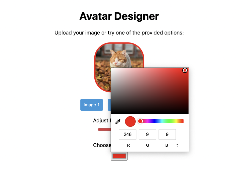
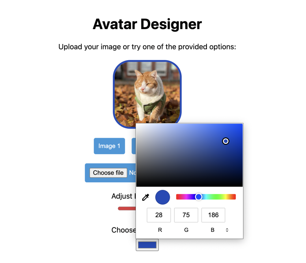
3b. Implement the border color
Add an event listener to the color picker and make sure you can read the value when the user changes the color.
Additional hints
Start by selecting the <input type="color">
Add a change event listener with addEventListener.
Read the color value when it changes and set it dynamically on the avatar image.
3c. Use proper default values
Write some CSS code to default the avatar image with a border color and border-radius. Then, use those same values as default values for the slider and color picker. You can test that this is working by reloading the page and making sure the avatar image has a border-radius and color that matches the default values of the two input elements.
Additional hints
You can use the value property to set the default values on the slider and color picker. This lets you set a range value for the slider and a color value for the color picker.
You can further customize the slider with the min and max attributes to avoid invalid values.
Step 4: Implement the image buttons
We'll now implement the functionality that lets the user change the avatar image by clicking on the image buttons.
Start by storing the path of the various images as a data attribute.
Additional hints
Here's an example of how a button with dataset would look like:
<button data-image="example/cat1.png">Image 1</button>
Then, add an event listener to each image button and make sure you can read the value when the user clicks on the image button. Then, use that image path and set it dynamically on the avatar image.
Additional hints
You will need to select the buttons and add an event listener to each button.
You can read the data attribute containing the image path using the dataset property.
Test your app and make sure it works with all three example images and different border-radius and color combinations!
Step 5. Improve the project (optional tasks)
Once you've completed all the steps, feel free to work on some of the optional tasks below. Remember that it's important to make things work at first and then make them better. This is why the first optional task is to go back to your code and make it better by refactoring it.
You can also implement or improve the design by making it match the one provided on Figma.
Here are some other improvements you can make:
- Add a toggle state to each button making it look like only one button can be pressed at a time.
- Add an additional slider to control the image size. Make sure you have reasonable min and max values.
- Store the selected border-radius and color values in
localStorage and restore them on page load.
Step 6. Finalize and deploy
Once you're happy with the project, you can build it and deploy it.
If you're using Vite, you can build the project by running npm run build. You can then run npm run preview to preview the production version of the project.
You can then deploy it to any static hosting website, such as Netlify or GitHub pages.
Et voila! You can now use this project in your portfolio! Attribution is not required but appreciated. If you enjoyed this project, please share it with your friends and check out LearnJavaScript.online!
You can also let us know if you have any feedback by filling out this anonymous feedback form.
The advanced version of this project lets you adjust the border-radius and color for a user-uploaded image by means of a slider and a color picker. You can also demo the product using the example images. Clicking on the image buttons (image 1, 2, and 3) swaps the image allowing you to preview different avatars using the same border-radius and color.
"Start by making it work and then make it better." We recommend you follow this advice when working on this (or any) project.Step 1: Set up the project
You can set up this project in any way you prefer. If you're a beginner and don't have a preference yet, we recommend you either build it online on a platform such as codesandbox.io (using the Vanilla and JavaScript template) or locally.
If you'd like to build it locally, we recommend that you use vitejs.dev with the vanilla template.
ViteJS instructions
These instructions assume you have node and npm installed.
Open your terminal and then run the following command:
npm create vite@latest
Then, enter your project name; for example, avatar-designer, and hit enter. Select the Vanilla option with JavaScript, for now.
Then, cd (change directory) into your new project and install the dependencies by running:
npm install
Whenever you want to work on this project, you will need to start the development server with:
npm run dev
Once you have a project where your changes appear in the browser preview, you're ready to move on to the next step.
Step 2: Create the page elements
Start by creating the various page elements such as:
- Avatar (square image).
- Three buttons labeled Image 1, Image 2, and Image 3.
- A file upload element.
- A slider input and a color picker input.
Additional hints
A slider input is an input element with type="range".
A color picker input is an input element with type="color".
You can find the design using the Figma link above (make sure to look at the design belonging to the Beginner difficulty).
While it would be nice to have the same design, we recommend you start with making the JavaScript functionality work first and then, if you want, you can spend time designing it. In all cases, don't try to tackle both problems (design and functionality) at the same time.
Create an example folder in your project and place three square images that you will use. You can also download and use the below images of my cat:
Then, set the img element's src to one of your three example images.
Step 3: Implement the dynamic borders
We'll now implement the functionality that lets the user change the border-radius and color from the relevant form elements.
3a. Implement the border-radius
Add an event listener to the border-radius slider and make sure you can read the value when the user changes the slider value.
Additional hints
Start by selecting the <input type="range">
Add a change event listener with addEventListener.
Read the slider value when it changes and set it dynamically on the avatar image. This requires many steps so take your time!
Additional hints
Select the avatar image and use the style property to dynamically set the border-radius.
You will also need to convert the string value to a number.
3b. Implement the border color
Add an event listener to the color picker and make sure you can read the value when the user changes the color.
Additional hints
Start by selecting the <input type="color">
Add a change event listener with addEventListener.
Read the color value when it changes and set it dynamically on the avatar image.
3c. Use proper default values
Write some CSS code to default the avatar image with a border color and border-radius. Then, use those same values as default values for the slider and color picker. You can test that this is working by reloading the page and making sure the avatar image has a border-radius and color that matches the default values of the two input elements.
Additional hints
You can use the value property to set the default values on the slider and color picker. This lets you set a range value for the slider and a color value for the color picker.
You can further customize the slider with the min and max attributes to avoid invalid values.
Step 4: Implement the image buttons
We'll now implement the functionality that lets the user change the avatar image by clicking on the image buttons.
Start by storing the path of the various images as a data attribute.
Additional hints
Here's an example of how a button with dataset would look like:
<button data-image="example/cat1.png">Image 1</button>
Then, add an event listener to each image button and make sure you can read the value when the user clicks on the image button. Then, use that image path and set it dynamically on the avatar image.
Additional hints
You will need to select the buttons and add an event listener to each button.
You can read the data attribute containing the image path using the dataset property.
Test your app and make sure it works with all three example images and different border-radius and color combinations!
Step 5. Implement the file upload
We'll now allow the user to select a local image file which we'll use to display the avatar. You will most likely need to use a search engine to look up how to complete this section unless you've worked with the below APIs before.
Start by adding a change event listener to the file upload element and make sure you can read the files value when the user selects a file.
Additional hints
In this example, currentTarget and target will both refer to the same element (the file upload element). You can use either.
Find the files property on the event's target. This should return an array of uploaded files (one file in our example).
You now have to use the FileReader JavaScript API to read the content of the file and display it using the existing avatar image. The instructions are more vague than usual as we'd like to encourage you to research this issue. Take your time!
You can further customize the allowed files by setting the accept attribute on the file upload element.
Additional hints
You can use the accept attribute to specify the file types allowed. For example, to only allow images, you can use accept="image/*".
Step 6. Improve the project (optional tasks)
Once you've completed all the steps, feel free to work on some of the optional tasks below. Remember that it's important to make things work at first and then make them better. This is why the first optional task is to go back to your code and make it better by refactoring it.
You can also implement or improve the design by making it match the one provided on Figma.
Here are some other improvements you can make:
- Add a toggle state to each button making it look like only one button can be pressed at a time. This should also reset when the user uploads an image via the file upload.
- Add an additional slider to control the image size. Make sure you have reasonable min and max values.
- Store the selected border-radius and color values in
localStorage and restore them on page load.
Step 7. Finalize and deploy
Once you're happy with the project, you can build it and deploy it.
If you're using Vite, you can build the project by running npm run build. You can then run npm run preview to preview the production version of the project.
You can then deploy it to any static hosting website, such as Netlify or GitHub pages.
Et voila! You can now use this project in your portfolio! Attribution is not required but appreciated. If you enjoyed this project, please share it with your friends and check out LearnJavaScript.online!
You can also let us know if you have any feedback by filling out this anonymous feedback form.